This is part two in a two-part series on categorizing small-scale producers. In the last post, we looked at the fact that the majority of the literature does not offer a definition of small-scale producer, and the diversity of definitions provided by the few articles which do. In this post, we look at three collections of tools that EPAR has developed to determine the consequences of choosing particular criteria and thresholds for definitions of small-scale producers. The first set is an open-ended tool for comparing the consequences of two definitions side by side, both for estimates of the size of the small-scale producer population as well as several indicators related to that population. The second visualization attempts to provide a framework for choosing thresholds for criteria based on year over year variability of those criteria at particular thresholds. The third looks at tracking households from year to year using a sixteen-category typology based on four dimensions: poverty, asset base, market orientation, and income diversification. While these visualizations do not give a clear, definitive answer to the question of how to define a smallholder, they provide insight to some of the tradeoffs of using different definitions. All of these visualizations use the LSMS-ISA indicators curated by EPAR.
Comparing the Consequences of Definitions:
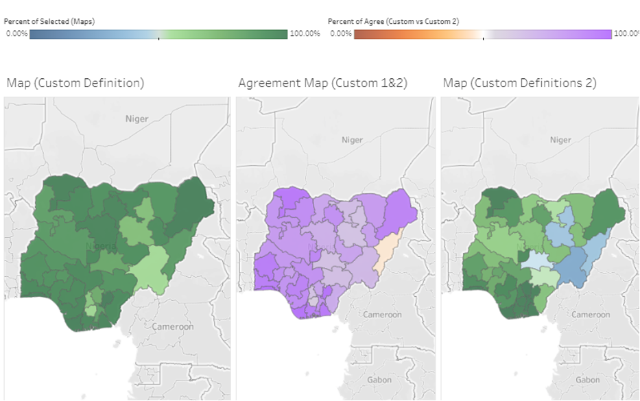
The first visualizations that we created in this process were also the most open ended. Due to the large amount of data needed to run this visualization, it is separated by country, with one for each of Tanzania, Nigeria, and Ethiopia. This visualization allows users to compare the impacts of two definitions side by side. Users can choose from a range of indicators, including Farm Size, Livestock, Proportion Non-Family Labor, Proportion Crop Value Sold, Total Annual Farm Income, Total Annual Income, Total Value Farm Production, Consumption, Rural vs Urban, and Gender of Head of Household. They can set minimum and maximum values for the thresholds for all of these indicators. They can do this with using either absolute values or relative (percentile) values. All of these indicators are considered to be "AND" or a Boolean conjunction for the selected households (a household must fall in between all of the selected thresholds to be classified as a selected household) and "OR" or a Boolean disjunction for the households that are not selected (if a household falls outside the thresholds for any of the selected indicators, then it is counted as not selected).
These visualizations then divide all of the households into four categories, those selected by both definitions, those selected by neither definition, and those selected by one definition but not the other and vice versa. The visualizations compare the size of these three categories in terms of number of households, landholding, livestock, and crop value. The visualization also shows the differences in estimates of indicators for each of these definitions and the geographic distribution of selected households.
The advantage of this visualization is that it provides a wide-open canvas to create any definition that one would like to test what the consequences are. It is useful to test a hypothesized definition of a small-scale producer and visually represent the distribution of those households. That said, this freedom also provides little guidance as to what exactly we should choose as a definition. It is not as useful of a tool for developing new hypotheses about which thresholds and indicators are useful to include in a definition. The other visualizations listed here are better positioned to answer these other questions.
Year Over Year Threshold Variability:
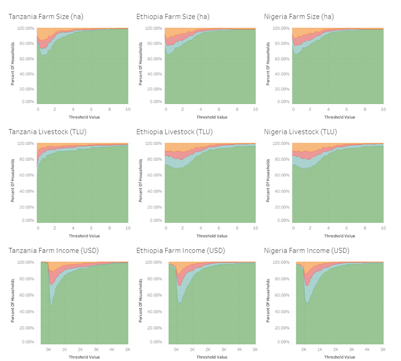
The second visualization that we created in this process was more focused on answering the specific question of which indicators, at what thresholds, have the greatest variability from year to year. Since the first visualization did not provide much guidance on potential hypotheses for determining better indicators or thresholds, we created a visualization focused on exploring the variability of these different indicators. We exploit the panel nature of the LSMS-ISA surveys to track individuals' households over three waves. For each indicator and potential threshold, we calculate the share of households which remained on one side of the threshold, moved across the threshold and remained there, or moved back and forth across the threshold. This allows us to visually represent which indicators have the greatest year over year variability, and what thresholds have more or less variability.
For any given criteria and threshold, with three waves of data, any given household can be categorized as fitting into one of eight different options. The household might start below the threshold and never move above it. It also might start above the threshold and never move below it. We classify households in both of these categories as households that "stay". Households may start below a threshold in the first wave of the survey, but cross the threshold in the second wave of the survey and remain above the threshold in the third wave. Households may also start below the threshold, remain below it in the second wave, but cross it for the third wave. These two types of households are classified as households which "increase" as they have moved across in a positive direction and not moved back. The two complementary categories, of households which start above the threshold, cross it in either wave 2 or 3 and never cross back are named households which "decrease." Finally, households which cross the threshold twice in different directions, regardless of whether they start above or below are classified as households that "fluctuate."
This visualization is not useful for testing out an individual definition of a small-scale producer or for tracking the multiple factors which influence the outcomes for particular households. However, it is very useful in providing insights as to which thresholds or indicators might constitute a consistent measure for targeting households, and which thresholds might be the most consistent over time. This is particularly useful since variability is a function of both the threshold and the indicator.
Sixteen Categories Of Households
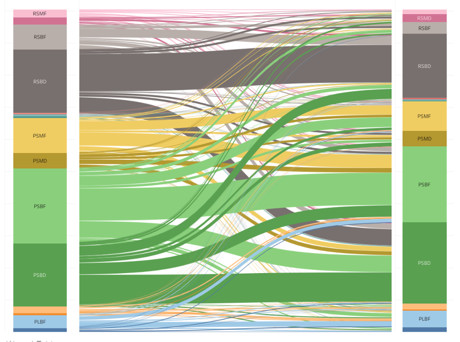
The third visualization that we created is less agnostic about the criteria to be used when dividing farm households. It is also unique, as it focuses on a typology of farms rather than just a yes or no definition. It provides a sample typology of small-scale producer farm households by dividing all households into sixteen categories. These categories are created by all of the possible arrangements of farms along four binary variables. Doing this allows us to investigate which types of these farms are the most likely to move out of poverty or grow in size.
The four characteristics that farms are divided by are poverty, asset base (a combination of livestock holding and farm size), market orientation (how much of the value of their farm production they sell) and their diversification of their income streams. Each of these options is given a letter, so that the categories of households can be identified by a four-letter string. Therefore, a household in the category of PSBF, is poor, small (in terms of asset base), subsistence (they sell a lower proportion of their production), and farm focused (they do not have much non-farm income. In contrast, a household classified as RLMD is rich (or at least above the consumption-based poverty line), large, market oriented, and diversified. The individual thresholds can be changed by users in order to determine how conclusions would change with a different threshold.
This visualization is particularly useful to see how the indicators of small-scale producers interact, and how much farm households move over time across all of these indicators. Hovering over a category in the table provides information on the characteristics of a particular group, including the percent of female headed households, and the average farm size. The bar charts include information about which categories of households are the most likely to move out of poverty, grow their farm size, become more market oriented, and become more diversified (as well as move backwards on any of these metrics. This visualization presents a specific option of a typology of farmers and demonstrates how such a typology could be used to draw conclusions about different groups of farmers. However, the criteria available are limited and it does not give information about the effects of particular thresholds. It is more useful for developing hypotheses than testing them.
Credits
By Terry Fletcher
Summarizing original EPAR research by Didier Alia, C. Leigh Anderson, Travis Reynolds, Pierre Biscaye, and Terry Fletcher