Skip to content

Choices with Consequences #2: Data Processing Decisions in Household Surveys

Defining “Urban” and “Rural”: How Urban-Rural Boundaries Shape What We Know About Development, especially when “rural” is simply what is not “urban.”

Key Takeaways

  • Definitions of “rural” and “urban” can affect indicators of economic development used for decision-making and funding allocations.
  • Within countries, periodically re-categorizing households as rural or urban can affect measures of rural poverty and other welfare indicators.
  • Across countries, different classifications can vary considerably and limit valid comparisons.  

Urban versus Rural Categorization

Source 1/Source 2

The majority of countries use an administrative definition to distinguish between urban and rural areas based on thresholds of population, density, size, or economic development.  But despite urban / rural categorizations commonly being used in agricultural and development analyses, and within global monitoring systems such as the Sustainable Development Goals (SDGs), there is no universal standard.

Almost a decade ago Moreno (2017) noted: Localities in Denmark or Iceland are urban above 200 inhabitants or more, whereas the Netherlands and Nigeria use a threshold of 20,000, Mali  30,000, and Japan 50,000 inhabitants. Some countries use multiple criteria. “For instance, urban areas in Bhutan need to satisfy at least 4 conditions out of 5 criteria: a minimum population (1,500 inhabitants), a threshold in population density (1,000 persons per sq. km), depend on non-primary economic activities (more than 50%), a minimum requirement for the area of the urban center (not less than 1.5 sq. km.), and the need to have economic potential for future growth (revenue base)”  (Moreno, 2017, p. 3).  

In all countries, urban–rural classifications play a central role in guiding policy interventions and serve as an important stratification variable in data collection. To understand how alternative urban vs. rural categorizations affect development indicators and related policy conclusions, in this blog, we summarize the approach followed in Wineman et. al (2020). We use data from four waves of the nationally representative data from Tanzania and Nigeria, focusing on the Tanzania National Panel Living Standards Measurement Study (TZNPS) from 2008 through 2014 as a case study. This dataset captures rural and urban households based on the country’s administrative definition. We also draw from various secondary data sources such as the 2013 WorldPop data set, 2016 NOAA DMSP-OLS Nighttime Lights Time Series data set, 2017 Global Man-made Impervious (GMIS) data set, 2017 Africapolis data set, and spatial data from Google Earth that have been used across countries and studies to map out urbanization.

Approaches for Defining Urban Areas

Although a country’s administrative definition might be considered the default for measuring “urban” areas, periodic reclassification – usually with a census – that nudges growing rural areas up into the urban category – leaves “rural” as the residual.  In many administrative definitions, “Rural” is de facto what is NOT “Urban”. We therefore examine alternative measures of understanding urbanization and rural welfare over time.

    Definition / construction
1. Administrative definition The official designation in each country
2. Population density A household is categorized as urban if the local population density is at least 500 persons/km2 (from WorldPop).
3. Impervious surface A household is categorized as urban if the share of impervious surface (man-made surfaces) cover is at least 2% (from the GMIS data set of Landsat).
4. Night lights intensity A household is categorized as urban if the intensity of night lights is at least 8 on a scale of 0 to 63 (from the NOAA DMSP-OLS Nighttime Lights Time Series data set).
5. Africapolis The designation of urban areas is provided by Africapolis, which bases its determination on the settlement population size (≥ 10,000) and the distance between buildings.
6. Local economy A household is categorized as urban if the average share of nonfarm income (excluding crop, livestock, or agricultural wage income) among the nearest 7 neighbors is at least 66%.
7. Subjective assessment A household is categorized as urban based on subjective assessment of Google Earth images. This labor-intensive categorization was applied only to the 2014 survey wave.
Table 1. Definitions of “urban” and “rural”

Impacts of Choosing Different Definitions of “Urban”

  • Cross-country comparisons of urbanization levels are sensitive to definition choice

We find that patterns of urbanization levels in Tanzania and Nigeria reverse depending on definition. For example, using the ‘impervious surface’ definition, Tanzania has a slightly larger urban population share than Nigeria. For all other definitions, Tanzania’s urban share is lower than Nigeria.
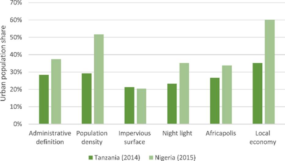
Figure 1: Cross-country comparison of urbanization levels in Tanzania and Nigeria.
  • Definition choice swings urbanization levels by ~ 20 percentage points

Urbanization represents a shift from a dispersed population toward one that resides in more densely populated settlements with more non-agricultural economic activities. The urbanization ‘level’ is a static point-in-time measure of the urban population share, whereas the urbanization ‘rate’ is the rate of change from a rural to urban area over time. Per official urban/rural designations, in 2014, 28% of the national population of Tanzania was urban. Between 2008 and 2014, the urbanization rate was 6%.

Using seven different definitions (Table 1), we find that urbanization levels ranged from 21% (impervious surface) to 39% (subjective assessment), and that urbanization rates over 2008-14 ranged from 6% (administrative definition) to 11% (night light and local nonfarm economy).
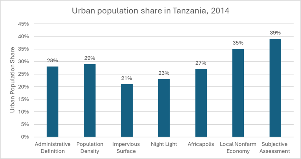
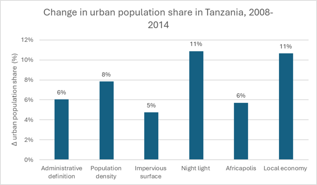
Figure 2: Urban population share in Tanzania, 2014. Urban population share by urban/rural definition using TZNPS LSMS-ISA household survey data.
Figure 3: Urbanization rate of change in Tanzania, 2008-2014. Urbanization rate of change by urban/rural definition using TZNPS LSMS-ISA household survey data.
  • Who counts as “rural” shapes what we know about rural poverty
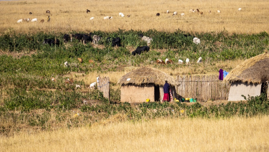
A country’s trajectory along the arc of structural transformation and poverty reduction has traditionally been tied to urbanization, and the economic orientation and rate of agricultural commercialization in rural areas.  Our analyses show that the definition of “urban” can affect measures of transformation. For example, the share of the rural population with electricity is estimated to be 3% with a local economy-based definition of urban but is 9% with the night light-based definition.

To unpack this, we compared welfare characteristics of households classified as rural under both the “administrative” and “night light intensity” definitions, to those that switch from their original category with a change in definition.  We find that compared to households which wererural under both definitions, those considered rural under the administrative definition but urban per the night light definition were significantly wealthier. The same applies for households considered urban under the administrative definition but rural per the night light definition. These areas that switch classification:

  • Have higher consumption and lower poverty rates
  • Spend less of their budget on food and access more of their food through purchases
  • Are more likely to live in homes with modern roof materials.

Lastly, we explored the income portfolios of rural households, focusing on the household’s farm income, covering the share of crop production, livestock production and agricultural wages. Across three definitions (administrative, night light, local nonfarm economy), we find that the average household income share from crops ranges from 37% – 42%, and the average income share from agricultural sources ranges from 57 – 64%. Using the administrative and night light definitions, we find that rural households are increasingly shifting away from agriculture. However, this trend is not consistent with the local economy definition, under which areas that are less agriculturally focused are recategorized to urban. Thus, “rural” appears to be static – these are, by definition, the areas that are not changing.

  • Periodic reclassification can create a false picture of stagnant rural welfare
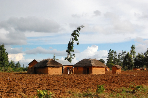
With each census, Tanzania recategorizes rural enumeration areas as urban if the town has a market, school, and/or health center and if the area essentially “feels” urban. Such a recategorization can result in rural poverty staying stagnant by definition, as successful rural areas are re-categorized as urban. Indeed, if we did not allow rural Tanzania to physically shrink over time, poverty declines slightly faster (by one percentage point), the rate of primary school completion increases faster (by one percentage point), and access to electricity increases faster (by two percentage points).

If the goal is to study transformation of the “rural” economy, care is necessary with data that crosses census reclassifications.

Lessons Learned

A 2022 UN Statistical Commission Side event announcement in 2022 noted that in addition to the centrality of urbanization in the SDG framework, it: “was also a call for collection of data at the urban level and/or disaggregation of reporting between urban and rural levels. Generation of data that is comparable at the urban level, however, requires clear definitions on what constitutes a city, as well as globally applicable metrics/ thresholds that can be applied across countries”. Until that time, large differences in official definitions of “rural”, challenge meaningful cross-country comparatives and rural time-series analyses by relegating “rural” as a residual category.

The different criteria underlying official definitions of “urban” and its residual “rural” are important to recognize when they guide country or global budget and resource allocations.

But the reality is that agreed upon and harmonized definitions may never emerge, and most official definitions are only focused on urbanization.  The good news is the amount of publicly available tabular and spatial data can supplement national survey data to provide insights on specific questions, particularly those focused on changes in rural populations. 

Blog written by: Samantha Petrelli, Vedavati Patwardhan and C. Leigh Anderson.

Based on: Ayala Wineman, Didier Yélognissè Alia, C. Leigh Anderson, Definitions of “rural” and “urban” and understandings of economic transformation: Evidence from Tanzania, Journal of Rural Studies, Volume 79, 2020, Pages 254-268, ISSN 0743-0167, https://doi.org/10.1016/j.jrurstud.2020.08.014. (Available here)

Additional References

Concepts, definitions and data sources for the study of urbanization: the 2030, Agenda for Sustainable Development, Eduardo López Moreno, Head Research and Capacity Development, UN-Habitat, 2017.
Announcing A New Series: Indicator Choices With Consequences

What

A series of blogs and technical briefs on the implications of alternative cleaning and variable construction decisions when constructing agricultural indicators. In this series, we will cover topics such as winsorization choices, representing women farmers and challenges constructing gender productivity gaps, inconsistencies interpreting the oft used phrase “improved seed,” and how the choice of prices affects estimates of value.

Why

Our work has surfaced differences in estimates for the same indicators, sometimes across the same data sources. Differences can arise from reasonable debates over proxies, for example, how to define rural, or identify a small-scale producer. Others arise from processing “shortcuts” that may be harmless and expedite the use of novel data, while others may have more serious consequences (e.g. calculating yields on intercropped plots without apportioning the area planted with each crop and how misidentification of genetically improved seed is associated with other plot management choices). Our goal is understanding when shortcuts are efficient, and when they can mislead decision-makers.

Even in top journals and even with access to the same raw data, without documenting rules or access to the underlying code, it can be difficult to understand construction choices that can nonetheless have important consequences. The practical application of this work is to understand when quick and cost-effective proxies are “fit for purpose” and when more precision and resources may be necessary.

Stay tuned for upcoming posts on this series!

Ag GeoSpatial Data Explorer (AgGeo): A Web-Based Tool for exploring Agricultural, Geospatial, and Climate Data 

In 2023, approximately 282 million people across 59 countries faced severe food insecurity, an increase of 24 million from the previous year. Sub-Saharan Africa (SSA) bears a disproportionate burden of this crisis. Climate change is already reducing cereal production across the region, with projections showing a further 20% decline by 2030. Food import bills in Southern Africa surged from $35 billion to $43 billion between 2019 and 2022. Africa is off track to meet the Sustainable Development Goal of ending hunger by 2030 and the Malabo Commitment to reduce poverty by half by 2025. Climate variability, rising temperatures, shifting rainfall patterns, and increasing frequency of droughts and floods, is fundamentally reshaping agricultural systems. Responding to climate shocks requires evidence-based policy, yet a significant gap persists between the availability of climate data and its practical usability for agricultural policy analysis.

The Data Access Challenge

High-quality climate datasets are increasingly available. The Climate Hazards Center (CHC) provides CHIRPS precipitation and CHIRTS temperature data at high resolution. NASA and other agencies offer temperature and vegetation data. These datasets are often free and well-documented, but “available” does not mean “accessible.”

Desktop software like GeoCLIM requires users to install QGIS, download several gigabytes of raw data, and have GIS expertise. Web-based alternatives like the Early Warning Explorer eliminate software installation but typically limit users to rectangular map regions and single-year time periods. Tableau needs pre-constructed datasets requiring massive storage. Most web tools provide only basic statistics rather than derived indicators that help identify drought-prone areas or understand seasonal dry spells. When researchers cannot easily access climate data, policy-relevant analyses either may not happen or rely on national-level averages that obscure local variation critical for small-scale producer (SSP) agriculture. The Ag GeoSpatial  Data Explorer (AgGeo) addresses these barriers through a web interface that processes data on-demand, follows actual administrative boundaries, and allows custom seasonal definitions matching agricultural calendars.

How the Climate Data Explorer Works

EPAR’s Center on Risk and Inclusion in Food Systems (CRIFS) developed AgGeo to address these challenges. Rather than requiring users to download and process data locally, the platform processes climate data on-demand and delivers results through a web interface. This directly tackles the software installation, bandwidth, and technical expertise barriers.

The platform covers countries across sub-Saharan Africa and South Asia. It is built on public datasets: The CHC’s CHIRPS provides precipitation data over four decades, while GAEZ provides spatial classifications of land use.

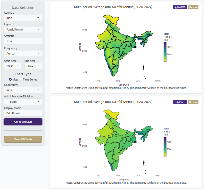
Users select their country, layer, and time period through a sidebar interface. The tool offers annual trends, seasonal patterns, monthly details, or quarterly summaries. Users choose between interactive maps (detailed grid values or regional averages with color-coded boundaries) or time series charts that are rendered within seconds. Users can hover over locations for exact values, zoom into regions, compare multiple territories, and download visualizations.

Figure 1: Average Annual Rainfall in India in 2020-2024

What the Tool Provides

AgGeo currently offers three layers that help researchers and policymakers understand climate variability and its agricultural implications.

Rainfall volumes track precipitation. Users can calculate total rainfall for any time period, understand typical rainfall intensity through daily averages, and compare across different regions. This helps identify wet and dry seasons, understand year-to-year variations, and spot long-term trends. Researchers can analyze data annually, seasonally, monthly, or quarterly, depending on their specific questions.

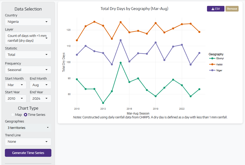
Dry days monitor drought patterns by counting days with minimal rainfall. This indicator helps identify drought-prone areas, understand when and where seasonal dry spells occur, and assess water availability during critical growing periods. Knowing how many consecutive dry days occurred during planting or flowering stages reveals much more about potential crop stress than total seasonal rainfall alone. This information helps target drought-resistant varieties or irrigation investments to the areas that need them most.

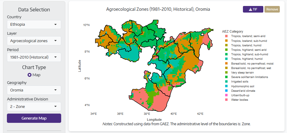
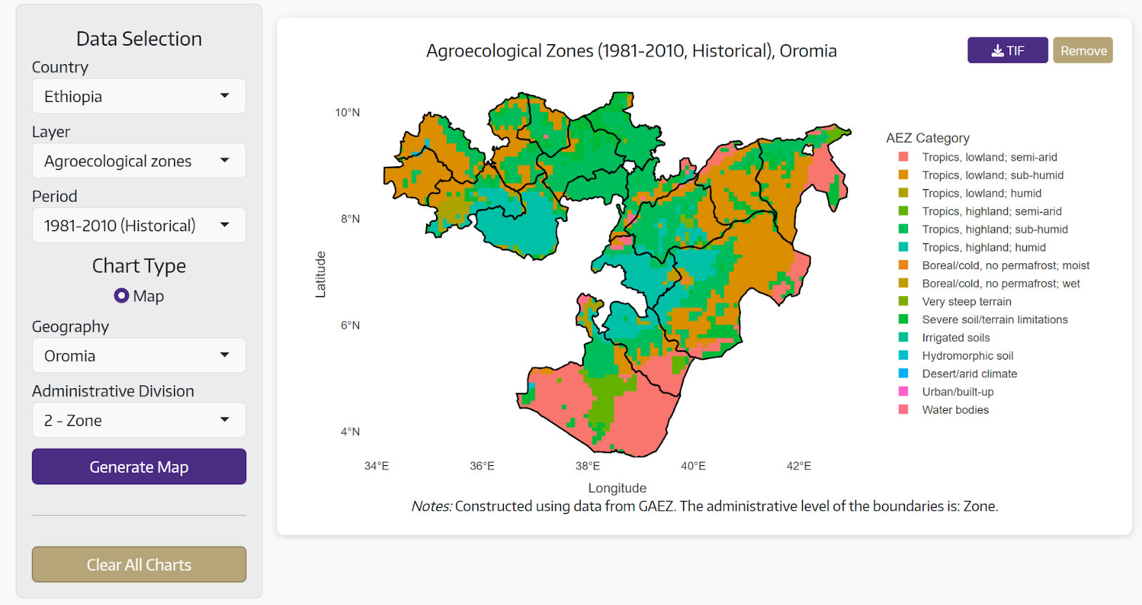
Agro-ecological zones visualize agricultural potential based on climate, soil, and terrain. The tool shows both current conditions and future projections, helping researchers and policymakers understand which areas are suitable for different crops today and how climate change might shift these zones over time. This supports long-term agricultural planning and adaptation strategies.

Users can explore climate patterns at multiple administrative levels, from entire countries down to individual states, districts, or smaller regions. The ability to compare multiple territories side-by-side helps understand regional differences and identify areas facing similar climate challenges.

Figure 2: Agro-ecological Zones of the Ethiopian Region of Oromia 

Why This Matters for Policy

Accessible climate data enables critical policy-relevant analysis. National planning offices can map rainfall variability to identify regions requiring different crop strategies or irrigation investments. Understanding spatial patterns helps target interventions effectively.

Program evaluations benefit from climate control variables that distinguish program effects from environmental factors. Food security monitoring reliability increases when analysts can quickly compare current rainfall to historical patterns, identifying regions at risk of production shortfalls. Researchers can identify drought-prone areas and analyze long-term trends to support climate adaptation planning.

Figure 3: Number of days with rainfall <1 mm in the Nigerian states of Ebonyi, Kebbi, and Niger during the 2010-2024 growing seasons (March through August)

Upcoming Features

The platform currently provides comprehensive coverage across sub-Saharan Africa and South Asia. Users can generate interactive maps and time series charts, compare multiple territories, and download results in multiple formats.

In the near future, EPAR plans substantial expansion including standardized drought indices, temperature anomalies, growing degree days for crop development tracking, and vegetation health monitoring. Integration plans include adding AgGeo within AgQuery+ and overlaying LSMS-ISA enumeration area coordinates for direct linkage with household survey data.

Getting Started

The Ag GeoSpatial Data Explorer is available at https://agquery.org/aggeo. The interface is designed for users without technical training. Select your parameters, generate visualizations, and download data through your web browser. You can click on the ‘About’ tab in the top-right corner of the app to learn more.

To cite this tool: UW EPAR (2025). Ag GeoSpatial Data Explorer: A platform for constructing and visualizing geospatial indicators for sub-Saharan African and South Asian countries.

EPAR welcomes feedback and suggestions for platform improvements. More information about EPAR’s work on climate and food systems is available at epar.evans.uw.edu.

Blog written by Apurwa Rahulkar and Joaquin Mayorga.

How Well Does Machine Learning Predict Food Insufficiency? A Case Study from Malawi

The World Food Programme estimates (pdf) that approximately 3.5 million Malawians are chronically food insecure. That number rises, and hunger becomes more acute, in the lean season between harvests. Seasonal hunger is further aggravated by limited storage options and extreme weather events, such as the recent weak rains that rendered 25% of the population acutely food insecure. The impacts of crop losses go beyond rural subsistence producers; they also affect urban consumers through the resulting food price shocks. 

In a recent article, we asked whether data related to crop production or markets could allow for greater precision in identifying which communities would face food insufficiency, which we define as a substantial proportion of households reporting “running out” of food in each month. Our data come from four waves of the Malawi Integrated Household Survey (IHS). Our goals were to understand whether using publicly available data derived from satellites and geo-coded market food prices with machine learning models could produce more accurate predictions than simpler approaches like classical regression or non-modeled human predictions based on past occurrences. To test the models, we first fit them using information from one or more survey rounds, then tested whether they could classify each community in the next survey round as food sufficient or food insufficient using updated predictor variables.

Our key takeaways were:

  • Producing accurate forecasts can require multiple years of data and, even in their simplest form, machine learning models still require some expertise
  • Prices, which reflect multiple factors on the supply and demand side, work as well as weather data
  • When food insufficiency recurs with some spatial and temporal predictability, machine learning models may not add substantial improvements to overall accuracy, but the distribution of communities predicted as food sufficient or food insufficient varies substantially by model, even at similar accuracy rates.

More details, including considerations for constructing indicators, specifying models and determining relevant predictors, are available in our paper.

1. Evaluating the Comparative Accuracy of Machine Learning Models

    Machine learning models can discern subtle patterns in large datasets, but the size requirement can restrict where the models can be effectively used. Using datasets that are too small can lead to low generalizability – fits are highly accurate on the sample used to develop the models, but extrapolations on new data may be weaker.

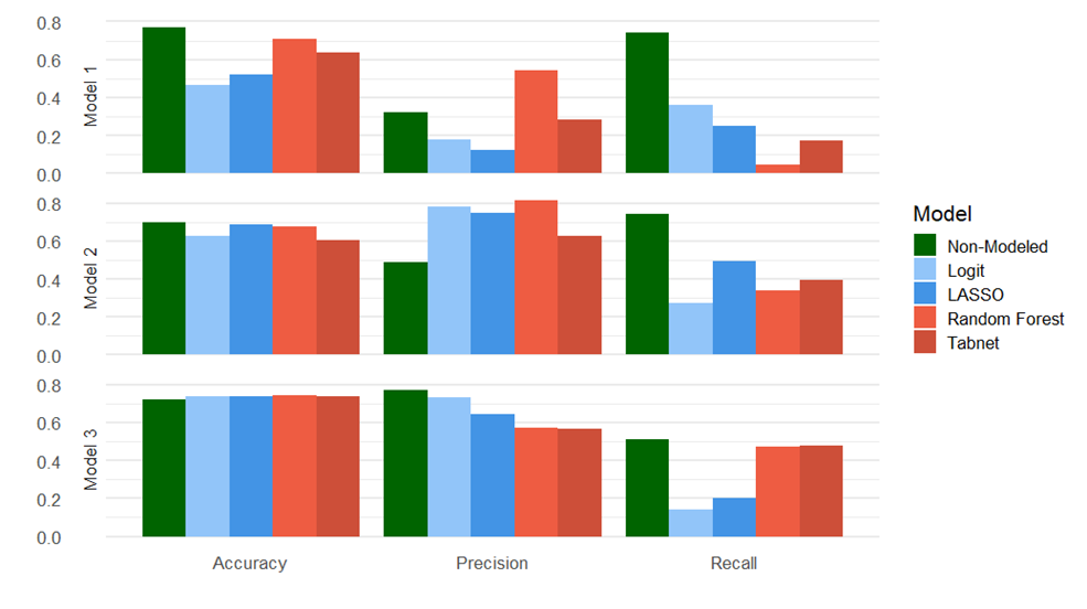
    To evaluate whether machine-learning was performing well given the available public data, we trained ML models on one to three rounds of the survey, testing on the second through fourth survey rounds, and compared them to classical regression and a non-modeled measure of checking the food security situation of the nearest neighboring community in the previous year. In addition to accuracy, we compared rates of false positive predictions (classifying food-sufficient communities as food-insufficient) and false negative predictions (classifying food-insufficient communities as food-sufficient) using two additional metrics: recall and precision. Recall represents the ratio of true positive predictions out of all observations of food insufficiency, and precision represents the ratio of true positive predictions to false positive predictions. Low recall scores indicate a bias toward producing false negative predictions, and low precision scores indicate a bias toward false positive predictions. We found that machine learning models tended to outperform on recall but under-perform on precision compared to the classical approaches and that model accuracy did not approach the simple non-modeled approach until three waves of survey data were used for training, a finding that indicates that although food insufficiency has high recurrence rates, the underlying reasons in a given year may vary.

    Figure 1:  Comparison of modeling approaches as the amount of training data increases (top to bottom: model 1: built using survey wave 1 and tested on survey wave 2; model 2: built using data from waves 1 and 2 and tested on wave 3; model 3: built using data from waves 1-3 and tested on wave 4). Blue bars represent simpler approaches (logit and LASSO, a minimal machine-learning example), red bars represent two alternative machine learning approaches, and the green bar represents a simple algorithm that uses the value of the nearest community in the previous survey.

    2. Comparing Prices to Weather as Leading Indicators

    Although the demand for staple crops is relatively stable, prices are affected by international trade, policy, weather, input prices, and other factors that affect supply. Hence, price movements offer a convenient summary of current and forecast changes in the availability of food relative to demand. 

    Using a primary measure of food affordability (observed maize market price over the prior year), combined with indicators of direction (maize price inflation and overall CPI inflation), we found that the predictions had similar or better accuracy compared to models that used variables that might influence agricultural productivity over the previous growing season, such as precipitation and temperature.

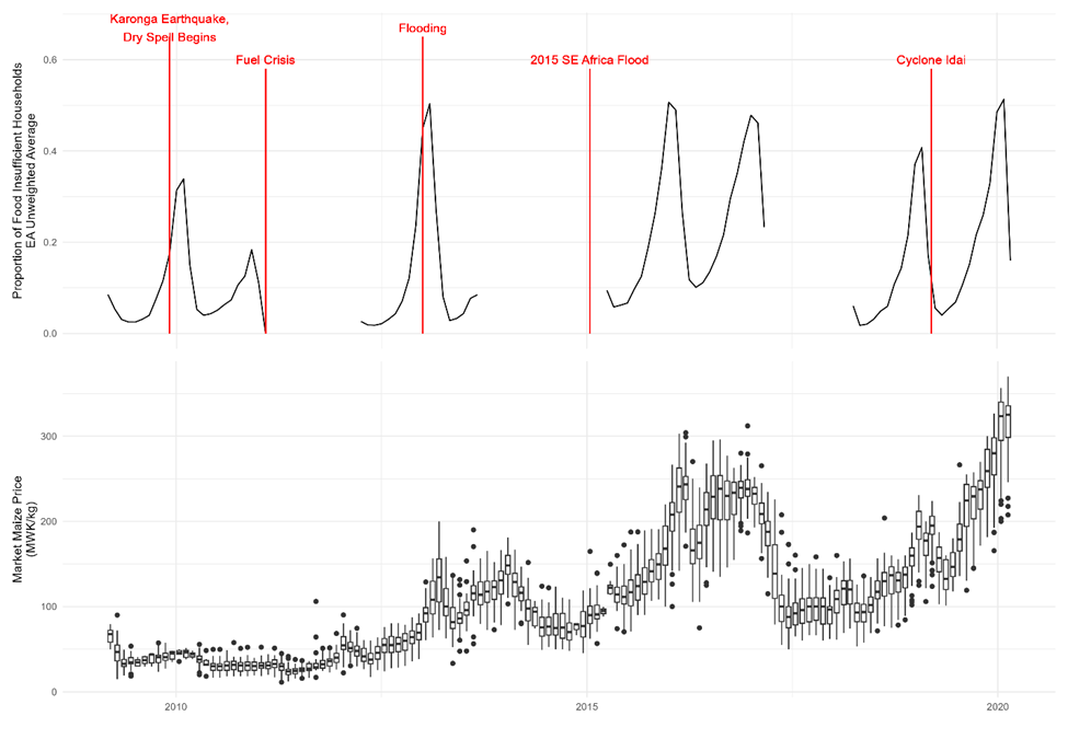
    In our datasets, food insufficiency was highest in December, January, and February, typically dropping in March and April. In Wave 4 (2020-2021), March was an unusually severe month due to shocks to production in the previous growing season, and price-based models were slightly better at reacting to that difference than weather-based models, which may have been more reliant on seasonal variations. The price-based models were also more sensitive to the transition back to widespread food insufficiency at the end of the dry season.

    One disadvantage of using machine learning compared to classical regression is that the former lack easily interpretable coefficients to assess the relative contributions of each variable. The Shapley Additive Values Framework was developed to help demystify modeling results and shows the effect each variable has on the final predicted value for each data point. Applying the Shapley framework to our fitted models suggested that prices in the past month and inflation in the previous year both had substantial, if mixed influences on predicted values. The most influential variable is the maize price in the previous month, but there is a mixed impact: low maize prices could be either a strong or a weak signal of future food insufficiency depending on the month in which the observation took place, while high maize prices tended to have a generally positive influence on predictions of insufficiency on positive predictions.

    3. Recurrence of Food Insufficiency

    Despite the weather and price volatility during the observation period, temporal stability, captured in a dummy variable representing the quarter when the observation occurred, was a highly influential factor in the model predictions. A large portion of the observed variation comes from seasonal swings in food availability. Much of the remainder is associated with the drought in southern Malawi, although spikes in flood-associated shocks to production also occur in the third survey round (Figure 2). These features of the agricultural sector in Malawi create a predictable spatio-temporal path for food insufficiency, making non-modeling prediction approaches based on historical occurrences of food insufficiency effective, although differences exist in which communities are flagged as food insufficient depending on the modeling approach being used.

    Figure 2: Top: Observed food insufficiency over four survey rounds, derived from recall over the previous twelve months prior to the survey date, and events impacting Malawian agricultural production or overall food sufficiency. Bottom: nominal market maize prices during the survey period.

    Conclusion

    While model accuracy may be higher in the absence of shocks like flooding and cyclones, historical observations of food insufficiency suggest that insufficiency in one year can arise from the consequences of a poor harvest in the previous year. Therefore, where recurring spatial patterns exist, decision makers could already have the information needed to act. Instead, modeling may offer benefits like increasing the utility of ongoing data collection for extrapolating to the rest of the country or providing visualizations of spatial patterns. The decreasing cost and increasing resolution of spatial data products could allow for detailed analyses to help inform policy-making, but only with frequent collection of training data. In resource-constrained environments, timely interventions based on informed priors may be preferable to gathering more information.

    The Data and Policy open-access manuscript is available here.

    Blog written by C. Leigh Anderson, Didier Alia, and Andrew Tomes.